|
|
Post by Tailsnake on Jul 25, 2006 16:08:06 GMT -5
SignaturesFeel Free To Commant all feedback is appreciated. They're in Chronological order, the top being the newest.  The Blue Bomber!  Zero... ... ... again... ... ... 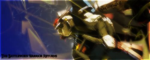 Gundam Mk II  Cloud FFVII  One Piece - TI parody 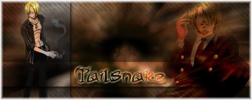 One Piece - Sanji  Naruto  Nu Gundam  Zero Final  Zero V3  Zero V2  Zero V1 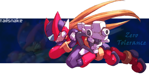 Zero Gif  Gundam  One Piece Love  One Piece, technically made by my friend  iSNAKE, what else can I say
|
|
|
|
Post by Shark on Jul 25, 2006 16:50:51 GMT -5
Great sigs, TS. I stand by my decision that "iSNAKE" is the greatest ;D.
I like the clever comments/ parodies you've put on some of them (i.e. Zero Tolerence, The Original One Winged Angel, and Luffy King).
And criticism... well there's not much I can say, since I'm not an art connoisseur.
|
|
|
|
Post by Purist on Jul 25, 2006 19:26:39 GMT -5
lol it's gunna take me years to make that many good sigs.
I personally like the 2nd sig because he looks like a gangster and it's got a lot of style.
This is definitely inspiring me to go make more. BTW, TS, what are the dimensions that you usually use your sigs?
|
|
|
|
Post by Shark on Jul 25, 2006 19:37:16 GMT -5
Well the dimensions of the ones there are either 500 * 150 or 500 * 200.
Lol, you guys can make beautiful sigs...
|
|
|
|
Post by Purist on Jul 25, 2006 20:26:35 GMT -5
Well...if you can afford to waste 2-3 hours at a time non-stop twiddling with photoshop for a few days...then magic will happen. I spent around a week on that sig, lol. But eh, what else should I do when it's 2 in the morning?
|
|
|
|
Post by Tailsnake on Jul 26, 2006 14:16:34 GMT -5
thanks for the compliments. I plan to make some more, I just need to find a good render to use.
|
|
|
|
Post by Tailsnake on Jul 29, 2006 19:34:46 GMT -5
well here's my latest attempt at art... 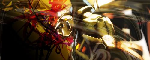 Feedback would be appreciated |
|
|
|
Post by Shark on Jul 29, 2006 19:45:33 GMT -5
Wow... for a second there I thought I was looking at official art, lol. It's the Wing Gundam, right?
The background is a bit unorthodox maybe, but it fits well to the overall look of the image. The wind-like effect makes everything look more exciting and moving.
Again, I'm not really an art critic but I think you've done a good job overall.
|
|
|
|
Post by Purist on Jul 29, 2006 19:56:09 GMT -5
Cool effects and shading, TS; it looks like it's about to fly off the sig and whoop me behind. I'm guessing it's the wing zero without the angel wings.
Anyway, did you use a 3D rendering program to do the background (and what's it called)? It's very impressive, but kind of clashes with the color and pose of the gundam. What I mean is, the background makes the gundam look like it's moving slower. The trails of wind, though, is definitely a keeper. I'm sure you can improve on it a lot and make it even more awesome (like Zero Final). Keep up the fantastic work.
|
|
|
|
Post by O-G on Jul 29, 2006 20:00:46 GMT -5
i think the wind effects need to trail from BEHIND the gundam...because right now he looks like he walking against a Hurricane or something...but the 3D background render looks pimpalicious
|
|
|
|
Post by Tailsnake on Jul 29, 2006 20:57:10 GMT -5
Here's V2... 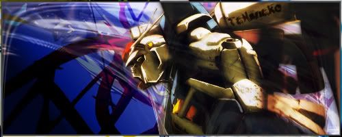 |
|
|
|
Post by Shark on Jul 29, 2006 21:02:21 GMT -5
Ah, nice. Even though there is less of the lines the gundam sticks out without problems now; the blue background also helps.
Slight improvement, but I like this one better.
|
|
|
|
Post by Tailsnake on Jul 29, 2006 22:06:39 GMT -5
Well I'm gone for the night, gonna watch some Elfin Lied then go to sleep
|
|
|
|
Post by Shark on Jul 29, 2006 22:19:40 GMT -5
Lol... I saw some pics of that show and it looks very bloody.
What's it about?
|
|
|
|
Post by Tailsnake on Jul 30, 2006 10:37:45 GMT -5
Well there's gore, nudity and a guy living with 3 teenage girls. I'm only 4 episodes in but it's rather good so far if you can stand the gore.
|
|
|
|
Post by O-G on Jul 30, 2006 11:54:50 GMT -5
hehe...the gundam looks like hes swinning now  but overall the picture looks much better |
|
|
|
Post by Tailsnake on Jul 30, 2006 12:04:10 GMT -5
V3  |
|
|
|
Post by Shark on Jul 30, 2006 14:34:41 GMT -5
Nice light/battle-worn look but I think I still like V2, with it's unique squggly lines and wind effect.
|
|
|
|
Post by O-G on Jul 30, 2006 14:48:47 GMT -5
o.O (has an idea) what if ou were to make the background totally black and then add a redish/yellowish aura around the gundam and then bring back the wind effects a slight bit around the head/shoulders of the gundam? just a thought  |
|
|
|
Post by Tailsnake on Jul 30, 2006 15:30:02 GMT -5
ye... about that... the source for V1 and 2 ware kinda saved over for V3, so I'd have to remake them (they wouldn't be the same but it should be easy: distort ->wave, distort->Polar Coordinates, lighten and reduce opacity).
|
|
|
|
Post by Tailsnake on Jul 30, 2006 18:09:38 GMT -5
space Theme? 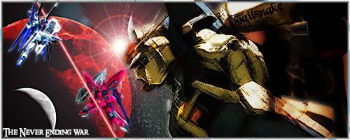 |
|
|
|
Post by Shark on Jul 30, 2006 18:31:07 GMT -5
Oh, wow, I like that one a lot.
But one thing is that the Freedom and Justice (I think) kind of take away from the large rusted Gundam as the focal point; unless that was your intention.
|
|
|
|
Post by O-G on Jul 30, 2006 19:58:24 GMT -5
nice sig but what is the red beam going between Freedom and Justice all about? lol and personally it'd be awesome if you made a halo 2 themed sig for myself  or a paintball'd one...im getting huge on paintball nowadays too har har |
|
|
|
Post by Tailsnake on Jul 30, 2006 20:50:04 GMT -5
Oh, wow, I like that one a lot. But one thing is that the Freedom and Justice (I think) kind of take away from the large rusted Gundam as the focal point; unless that was your intention. I wanted it too look like there was a battle there, but Freedom and Justice are too "new" looking, BTW the huge rusted Gundam is Gundam MK II from the early UC timeline. |
|
|
|
Post by O-G on Jul 30, 2006 21:21:31 GMT -5
lol...the rusty gundam is also looking the wrong way to even see freedom and justice XD
|
|