|
|
Yar!
Sept 5, 2006 6:16:21 GMT -5
Post by Purist on Sept 5, 2006 6:16:21 GMT -5
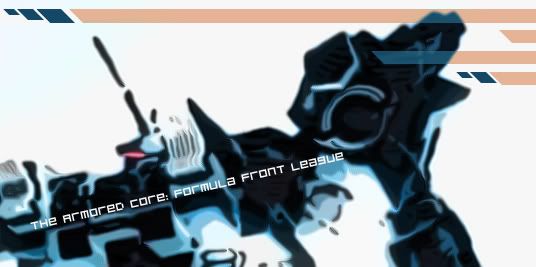
 I stayed up until a few minutes ago working on this piece, which I just finished. I had a sudden inspiration to toy around with Photoshop to produce a "decent" piece of work, and this is what I got so far. The size isn't fit for a banner, but still, I tried. The AC is taken from an AC4 screenshot from IGN (thanks to Dark for linking me). At first, I wanted to imitate the cel-shading-esque technique used for the model AC on the AC:FF cover art: www.sunhangcheong.com.hk/PSP/games-12-dec/psp-japanese-Armored%20Core-Formula%20Front.jpg, but........things got a little ugly after I tried using Photoshop's "Cutout" filter and some other hopeless things. However, I DID get something that looks remotely like the picture above, and so I told myself to continue at....1 or 2 in the morning. Because fake cel-shading didn't work for me but WAS able to make something that caught my attention, I basically continued to use Cutout, along with Diffuse, and some Gaussian Blur, in order to get a beautifully-rendered piece of CG work to look like the warped blue thing that proudly sits above all this text. The background is QUITE bare, so to balance the thing out, I added those little tan-orange streaks instead of designing a background completely from scratch (the background of the original CG photo consisted of some buildings and landscape, but Cutout somehow churned out the milky BG color that the picture currently has). As for the font, it's the one I used for the FPL Tourney Bracket - Bitdust2. If I'm going to try to improve this thing, I'm going to make a background for it first. Anyway, comments much appreciated. |
|
|
|
Yar!
Sept 5, 2006 18:32:06 GMT -5
Post by shearx on Sept 5, 2006 18:32:06 GMT -5
that's cool jacques. If you'd like, you can format it to the right size, and I could make it the banner for the forums...
|
|
|
|
Yar!
Sept 5, 2006 21:58:55 GMT -5
Post by Shark on Sept 5, 2006 21:58:55 GMT -5
It seems as though you've outdone me, lol.
Great work. Love the cel-shading-esque effect.
|
|
|
|
Yar!
Sept 6, 2006 0:01:11 GMT -5
Post by Purist on Sept 6, 2006 0:01:11 GMT -5
I was considering using a REAL AC:FF AC to dress up our banner....I mean, since I now have IR Shell, I can easily take snapshots and try to modify any screenshot and play around with it to get the "best-looking" banner.
Anyway, I guess we can all post some "possible banners" here. I like the one that Dark sent me because somehow he got the AC's textures to look real smooth (and how did you eliminate the background so "cleanly"?!...I cheated with Cutout). Although my AC's got a nice dark tone to it, Dark's rendering actually gives the AC more dimension. It's just that certain parts (like the head), seems to be swirled at an angle.
Anyway, I'm sure that with our combined efforts, we can make some killer piece of art.
|
|
Herald Of Hell
Chief Mechanic  There will be no peace, only... CHAOS!!
Posts: 134
|
Yar!
Sept 6, 2006 17:32:30 GMT -5
Post by Herald Of Hell on Sept 6, 2006 17:32:30 GMT -5
...... Cool man, i like it and i usually hate art unless it's full of blood and gore.......
|
|
|
|
Yar!
Sept 6, 2006 23:06:47 GMT -5
Post by Purist on Sept 6, 2006 23:06:47 GMT -5
Thank you, thank you. Haven't had time to start taking snapshots of several ACs on this board that I find to be "especially attractive" (I'm not telling ^_^), but I will get to it as soon as I have time. I thought my only purpose in this world was to play Loco Roco, and I haven't even had time to dash to EB to get my long-awaited piece of pure happiness. Anyway, back to this banner thing. I THINK that I am going to link the AC Beauty Pagaent to this thing, and the winner's AC WILL be featured on ONE of the possible banners (that I'm making) that may be used for the League. This may up the incentive for some people to get building...so far, I gotta give it to animesou for her solid designs. I will try my BEST to keep the original color scheme alive for the "winner(s)". Here's the original pic that I rendered my blue thing from: media.ps3.ign.com/media/761/761163/img_3845859.html. I think that I did okay with adjusting the colors and keeping everything smooth (my computer's bad graphics card made the image kinda choppy, so I did what I could), and I hope I will be able to reproduce or BETTER the Cutout effect on my future renders. So............START BUILDING AND SUBMITTING PRETTY AC's FOR THE PAGAENT, GUYS!!! |
|
|
|
Yar!
Sept 7, 2006 18:25:46 GMT -5
Post by O-G on Sept 7, 2006 18:25:46 GMT -5
is it just me or do those arms look like they might be a new addition to the GIBBON series...? they resemble the first ones in the series quite a bit if you look at the IGN photo
|
|
|
|
Yar!
Sept 7, 2006 19:47:42 GMT -5
Post by Purist on Sept 7, 2006 19:47:42 GMT -5
lol...perhaps. I don't think FROM would remake all the parts from scratch anyway...so there must've been some crossing over of concepts of parts from the AC parts line.
|
|
|
|
Yar!
Sept 10, 2006 16:16:10 GMT -5
Post by Tailsnake on Sept 10, 2006 16:16:10 GMT -5
DO you want me to try and make a new banner?
|
|
|
|
Yar!
Sept 10, 2006 16:30:28 GMT -5
Post by Shark on Sept 10, 2006 16:30:28 GMT -5
New banners to add to the collection would always be cool.
But you don't have to if you don't want to.
Edit: Then Jacques and TS will have a lil' competition... lol. I kinda exclude myself since the current one probably wont be as good as what they make.
|
|


